
OBJECTIVE
Showcase personal branding through graphic development, package design, and print production techniques
Inspiration + Brainstorming
we are…


The Vitruvian Man
Exemplifying the confluence of art and mathematics made manifest during the Renaissance, Leonardo da Vinci’s iconic Vitruvian Man embodies the symmetry of efficiency and innovation. Symbolizing balance, precision, and the pursuit of perfection, the Vitruvian Man is at once trustworthy and progressive, classic and timeless.
Branding
brio (noun)
: enthusiastic vigor; vivacity, verve


Explore BRIO
Package Design: Focused
A palm-sized paperboard breath mint container is used to convey the “focused” core trait of the Brio persona. As peppermint has been shown to promote concentration, a clean, comprehensive square package form allows the concept to speak for itself.
The dynamic “Fresh” cutout reveals the underlying prism motif, balancing vibrancy with a minimalist message; the bold simplicity and organic sensibility further communicated by the mint leaf image.

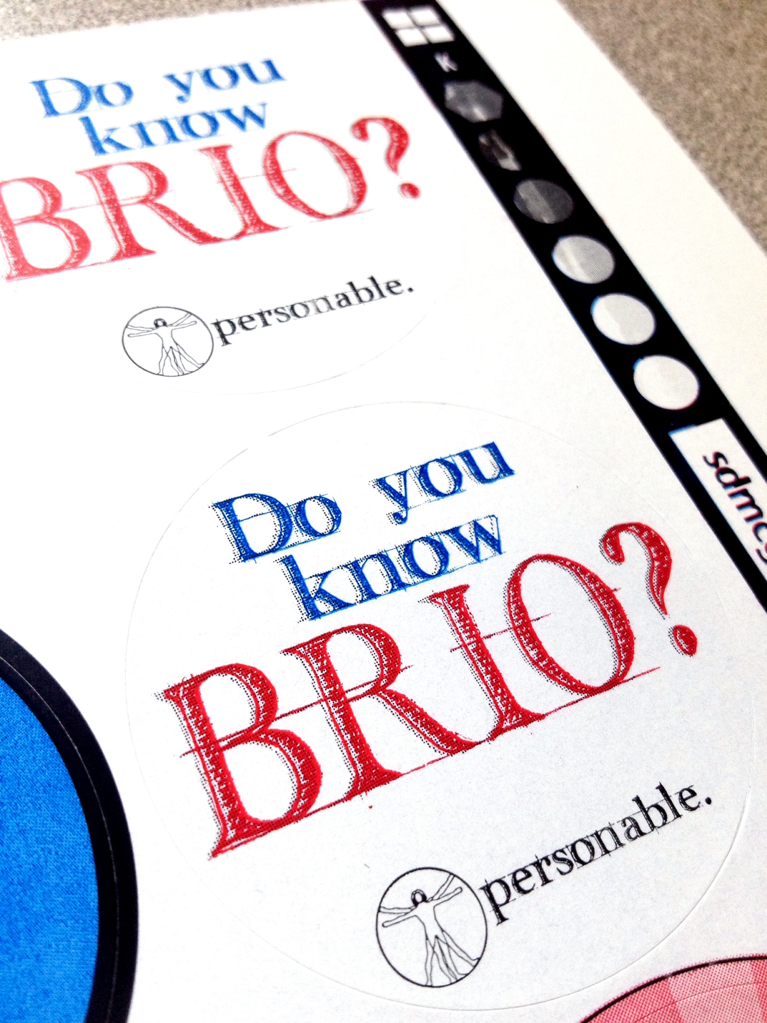
Flexography Label: Personable
A circular, adhesive label posing the question: “Do you know BRIO?” begs passerby to ask: “What is Brio?” The bold, sketchy, letter block typeface conveys the precise yet avant-garde mood of the brand.
The red and blue color scheme used for the prototype labels shown here contributes to a decal that is high-contrast yet approachable. This component of the toolkit embodies another core trait, “personable”, as it sparks a conversation about Brio, instigating face-to-face communication and a personal connection.
Lithography Card: Technical
To embody technical mindedness, a wallet-sized lithography-printed card features several trade tools. On the front, a duotone mechanical image overlaid with the Brio man motif represent the complexity and versatility of the Brio skill set. The core trait, “technical”, is featured alongside.
On the back of the card, an array of reference tools is presented: a flute height indicator for corrugated cardboard in standard and metric units; a diagram of bottle finish conventions; and a polymer recycle code index. A QR code guides visitors to more information on the Brio brand.


Screen Printed Notebook: Organized
The notebook embodies the process of organizing and converting the abstraction of thought into words, sentences, or sketches. The portability and durability of the book—hard-backed and canvas covered—speaks to the versatility of the Brio persona.
The pool blue outer binding draws an appealing contrast with the persimmon and frost offset Brio logo, adding depth and complexity, and highlighting a Brio core trait: “organized.”
Brio Unlimited
Personal Branding
Brand Development, Graphic Design, Packaging Design, Print Production